

Amongst the many technical indicators, the Relative Strength Index stands out as one of the most popular and widely used formulas used in trading. By providing signals of when to buy or sell an asset based on its strength or weakness, it is one indicator to keep in mind when creating strategies.
By simply writing some lines of code, we can easily calculate this indicator for any asset and even display it visually.
If you prefer to do so, you can also follow the video tutorial and get the same results!
Now, without any further ado, let’s get started!
Importing required libraries and loading the data
In this tutorial, I will try to minimize the use of unnecessary libraries, and with the exception of matplotlib and yfinance (Yahoo Finance) we’ll stick to libraries that are part of the standard library.
import yfinance as yf
import matplotlib.pyplot as plt
from datetime import datetime
Also, let’s go ahead and import the time series data of a random asset and load it into a dataframe (automagically done by yfinance). Despite having said that I’ll choose randomly, I’ll stick to what is popular and use Bitcoin. We’ll tell yfinance to retrieve the longest (period=”max”) daily (interval=”1d”) data. possible.
To have the same data regardless of the date you’re reading this, I’ll filter the data by DateTime.
# Load the data into a dataframe
symbol = yf.Ticker('BTC-USD')
df_btc = symbol.history(interval="1d",period="max")

# Filter the data by date
df_btc = df_btc[df_btc.index > datetime(2020,1,1)]
df_btc = df_btc[df_btc.index < datetime(2021,9,1)]

# Print the result
print(df_btc)
You might have noticed that in addition to the regular columns (Open, High, Low, Close, and Volume), we also got two additional ones: “Stock Splits“, and “Dividends“. Given the fact that we are currently dealing with a cryptocurrency, we can go ahead and delete these two columns.
# Delete unnecessary columns
del df_btc["Dividends"]
del df_btc["Stock Splits"]
Coding the Relative Strength (RSI) Index in Python
I’ll show the code in snippets to explain it line by line. First, we calculate the difference between each closing price with respect to the previous one. This step leads to the first row having a missing value (na) because it has no previous row to calculate the difference. This is why we also drop all rows with missing values.
change = df_btc["Close"].diff()
change.dropna(inplace=True)
I’m following the definition given in Wikipedia’s article for the calculation itself.
# Create two copies of the Closing price Series
change_up = change.copy()
change_down = change.copy()

#
change_up[change_up<0] = 0
change_down[change_down>0] = 0

# Verify that we did not make any mistakes
change.equals(change_up+change_down)

# Calculate the rolling average of average up and average down
avg_up = change_up.rolling(14).mean()
avg_down = change_down.rolling(14).mean().abs()
Finally, let’s use the previous steps and put them together to calculate the RSI itself!
rsi = 100 * avg_up / (avg_up + avg_down)

# Take a look at the 20 oldest datapoints
rsi.head(20)
It is worth mentioning that you might find differences between these results and those obtained on popular libraries and even (unless configured correctly) on TradingView. This is because it is also a common practice to use the exponentially weighted moving average (EWMA) instead of the moving average we used here.
Finally, the most visually pleasing part of the tutorial: plotting the results! Since we want our chart to look nice, we’ll go ahead and change some of matplotlib‘s parameters:
# Set the theme of our chart
plt.style.use('fivethirtyeight')

# Make our resulting figure much bigger
plt.rcParams['figure.figsize'] = (20, 20)
Now that we have done that let’s code the lines in charge of plotting our beautiful calculations!
# Create two charts on the same figure.
ax1 = plt.subplot2grid((10,1), (0,0), rowspan = 4, colspan = 1)
ax2 = plt.subplot2grid((10,1), (5,0), rowspan = 4, colspan = 1)

# First chart:
# Plot the closing price on the first chart
ax1.plot(df_btc['Close'], linewidth=2)
ax1.set_title('Bitcoin Close Price')

# Second chart
# Plot the RSI
ax2.set_title('Relative Strength Index')
ax2.plot(rsi, color='orange', linewidth=1)
# Add two horizontal lines, signalling the buy and sell ranges.
# Oversold
ax2.axhline(30, linestyle='--', linewidth=1.5, color='green')
# Overbought
ax2.axhline(70, linestyle='--', linewidth=1.5, color='red')
You can refer to the documentation if you want to read more about subplot2grid and the logic behind the first lines.
One final line of code to see our plot:
# Display the charts
plt.show()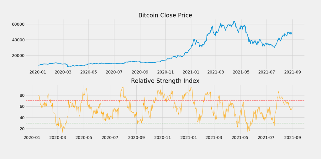
Visually we can see the exact dates where we should have bought (crossing below the green line) and where we should have sold the asset (crossing above the red line).
Conclusion
The Relative Strength Index is an indicator that any algorithmic trader worth its salt should have used at least a few times. It is also worth noting that it is a valuable tool in conjunction with other indicators and trading signals.
To summarize, we learned how to fetch up-to-date financial data from Yahoo Finance and manually calculate the RSI. Although plenty of libraries can do these calculations for us, a serious algorithmic trader should be able to understand how to do the implementation from scratch.
No responses yet